

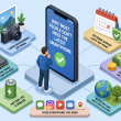
When it comes to web browsing and the importance of internet in general lives, there is no denying about this. Internet has become a must thing for everyone especially for young generation who always want to stay online on social media application i.e. Facebook, Twitter and Instagram. This has not only changed how people interact with the websites and communication platforms but it has also emerged a new era where people are focusing more on their mobile phones. Mobile phones have become a must have component of everyone’s life and because of the reason that you can perform unlimited tasks on your mobile; it has become a go to gadget for most of us. These days, people prefer keeping a good smart phone in their pocket instead of carrying a heavy laptop. The reason is that now your mobile phone can perform and handle almost all the tasks that a laptop can do.
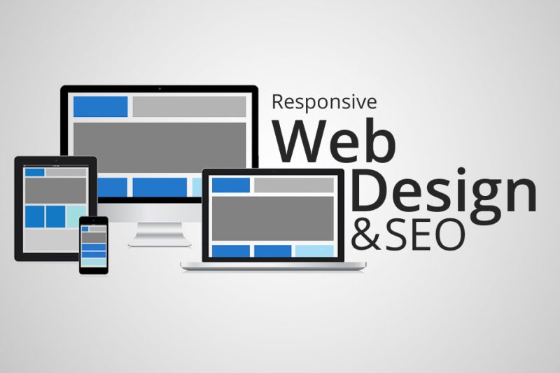
Due to this drastic change in the behavior of people and their level of interaction with their mobile phones, it was also necessary for the internet and website business to change the way they operate. As a mobile phone user, if you find out that you can’t browse your favorite website on your mobile because its interface is not compatible with the operating system, it will make you search for an alternative website that has the facility to be browsed on your mobile phone. The amazing thing to understand here is that not most people understand that the same responsive design of your website that will allow smart phone and tablet users to search content on the go can also enhance your search engine optimization. This will ultimately not only increase your rating in search engine ratings but it will also benefit you for getting higher number of visitors.
Some benefits of responsive web design for SEO:
- Same website for all devices:
When you have a separate website for desktop users and a different one for mobile phone users, it will not only require having 2 separate domain names but some users will simply leave it because they have to remember different URLs for opening the same website on desktop and mobile. With the responsive web design, it’s very easy to just handle 1 domain name because the design and user interface of the website will adapt to whatever device it’s opened on. This will also hugely benefit the way you do SEO for your website.
- Increase browsing speed on go-to gadgets:
It’s a simple thing to understand that if a website is designed to be used on a desktop, it will definitely take more time to load and open on a gadget i.e. mobile or tablet. But, on the other hand when you use a responsive web design for your blog or website like founder of nogentech is using, it’s the same website but it opens and browses faster than the desktop website. This will allow more users to visit your website ultimately resulting in higher number of engaged visitors.
- No duplicate content:
This is a real problem that when you have to handle the same content for 2 websites because either of them is only suitable only for desktop or mobile, it will create some issues and errors for search engine crawlers. When a search engine identifies duplicate content, it automatically put the website behind on the listing and this wastes all of the time and money you spend on SEO techniques. With responsive web design, you are basically handling one website so there is no chance of duplicate content.
